Monday 27 October 2014

Seven Photographs that changed fashion

Fashion photographer Rankin Rankin reconstructs seven provocative images by the most influential fashion images of the Twentieth Century, he chose seven of his favourite images by the photographers and he takes a journey through a brief history of the fashion photograph. By re-staging iconic images by Cecil Beaton, Erwin Blumenfeld, Richard Avedon, Helmut Newton, Herb Ritts, David Bailey and Guy Bourdin, Rankin exposes the ways in which fashion photography uses fantasy and beauty to communicate something about reality.

Heidi Klum, Erin O'Connor, Jade Parfitt, Sophie Ellis-Bextor, Tuuli Shipster, Mollie Gondhi, Daphne Guinness and David Gandy are the models for Rankin's shoots, while other contributors include David Bailey and Lillian Bassman.

This programme was last shown in 2009 and all the photographs Rankin recreated were shot in 2008. Rankin met some of the photographers them self however as some of the photographers has sadly passed away Rankin found their assistants and family members to talk about there personality and what they were like to work with.


In Rankin's interpretation of the 1955 image of elegant Dovima with Elephants, Erin O'Connor stands in for 1950s aristocratic beauty Dovima, who wore the first Dior dress to be designed by Yves Saint-Laurent.
Picture: RANKIN. HOMAGE TO RICHARD AVEDON - DOVIMA WITH ELEPHANTS 1955

Picture: RANKIN. HOMAGE TO CECIL BEATON - HAT BOX 1934


Guy Bourdin, 1970, Untitled. Rankin chose the fashion designer/socialite/model Daphne Guinness to recreate the iconic look of this image,


Typically classic and timeless, this 1963 image by David Bailey originally featured Jane Shrimpton. Bailey was present at the shooting of this remake, posed for by Rankin's girlfriend Tuuli.
Picture: RANKIN. HOMAGE TO DAVID BAILEY - JEAN SHRIMPTON

British supermodel Jade Parfitt makes a wonderfully angular and androgynous Helmut Newton model in this remake, shot in the original Rue Aubriot in the shadow of Newton's Paris studio.

Picture: RANKIN. HOMAGE TO HELMUT NEWTON - RUE ABRIOT FOR VOGUE 1975


Herb Ritts' original rugged, available mechanic 'Fred with Tires' was more a celebration of muscle and vein than strictly fashion. Nonetheless, Ritts' has almost become a formula for advertising. Model David Gandy poses.


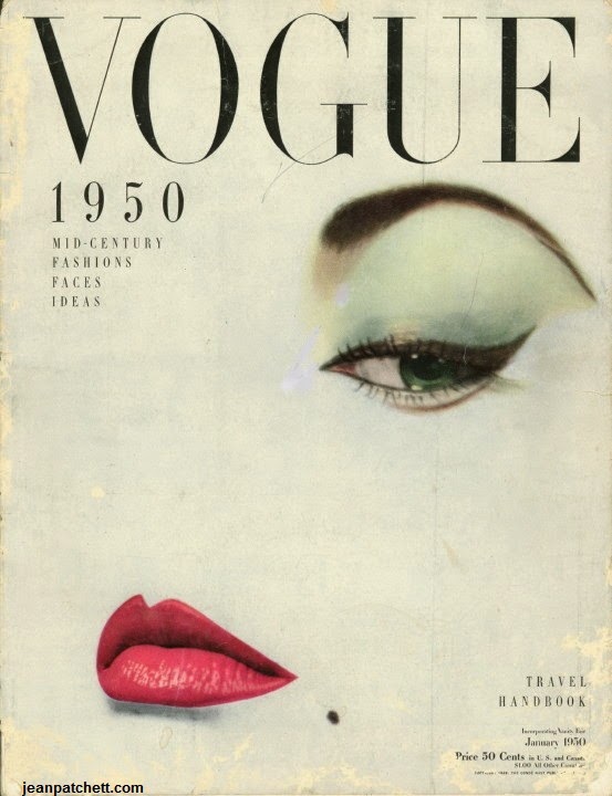
In 1950 Vogue opened the decade with an abstract January cover piece by Erwin Blumenfeld. Model Heidi Klum licks her lips in Rankin's raunchy version of the Vogue cover femme fatale

Picture: RANKIN. HOMAGE TO ERWIN BLUMENFELD - VOGUE VCOVER JANUARY 1950 


My favourite photo out of the seven is the January Vogue cover 1950. I think even though there is so little features in the photograph it's still a strong vibrant image. The eyes and the lips are strong and bold with colour, the amazing thing is this photograph is originally shot in black and white and the colour was edited in afterwards. I like like how the face and the whole of the cover is bleached out white fade together this makes it look like the face and page is one. The make up completely represents the 1950s era and the beauty spot reminds me of a Marilyn Monroe look who was also around in that era. The face expression is serious however very beautiful as the lips and the eyes have no expression. The nose has been bleached out from the page however it isn't questionable where the nose is as the eye and lips are so strong and is the focus of the page. The colours and the style of the photograph reminds me of pop art, the make up and features are so on point that it looks like a drawing with the bold but subtle colours. Rankins version is spot on to the original and as he said he wanted a 21st century modern interpretation of the vogue cover. Rankin used model Heidi Klum and in the spur of the moment during the photo shoot she licks her lips and Rankin decided that was the raunchy version he wanted to use. He speaks in the documentary that, that's exactly what he wanted a cheeky 21st century twist on the original.


Here's a link to watch the documentary-

http://rankinfilms.com/documentaries/#v-3552


Photographs-

http://www.telegraph.co.uk/culture/4161221/Rankin-Seven-Photographs-that-Changed-Fashion.html
http://www.bbc.co.uk/programmes/b00gq75c
http://ashleigh-chapman.blogspot.co.uk/2010/03/rankin-seven-photographs-that-changed.html

Friday 24 October 2014

Self portrait

Portraying my personality in a photograph-

I have taken this photo as my self portrait. I was stood in this particular position for a reason showing the objects in the background. It starts with showing my TV screen/computer, this is because I love social networking sites, browsing the web, online shopping and also skyping my family and friends and also keeping up to date with the fashion and make up artists and of course posting on this blog. I also love watching movies and films, I hardly ever watch television as I'm more of a movie person- this also explains my DVDs on the top self. Above my TV is my photo collage I printed before arriving to Southampton and then above that is another board with more photos. These photos contain pictures of me and my partner of nearly 5 years, my close friends and family member. I can honestly say i'm a photo hoarder I love keeping and collecting photographs because I love keeping the memories, my worst thing when I'm older would be to have no photos of me as a child/teenager. I also have my University project brief and my summer project mood board which is a collage of photos of who and where I want to be in the future. Looking and seeing this everyday determinants me to follow my dream and always push myself. On the top self I have books and letter in the boxes which shows i'm organised and I like to keep things neat and together. Under the desk is shopping bags of my recent shopping spree this is because I love going into town with the girls and buying new clothes from my favourite stores. Apart from that I took this photo in my bedroom at Uni, it doesn't feel like home yet however it shows where I'm going to be for the next year in my life and that I'm here to study make up and hair design which is my dream. I'm smiling because I do prefer to be smiling as I feel it portrays my personality which is happy and energetic. I have my normal day to day make up on and my natural hair clipped up which shows I'm comfortable and easy. 

Monday 20 October 2014

Monochromatic Make up

During our Practical lecture we had to create a monochromatic make up which we firstly designed on a face charts. We had to pair up during our practical and each be the model, we had a total of 40 mintues to create our whole look. This first photo is of my station this is the make up I worked with I used products from Charles Fox, MAC, Illamasqua and Rimmel and worked with a wide variety of brushes from various brands.


My looked was based on the colour pink. It was more of a beauty look instead of something crazy and different. My model had very fair skin so I had to mix a few of the foundations together to create her skin tone as I didn't want her to look too pale as I didn't want the skin to look washed out of dull. For my models skin colour I used a mix of Alabaster and FS38, this was from the ultra foundation 8 palette by Charles fox (Kryolan). And to set the foundation I used the Illamasqua translucent white powder.
When starting on the eyes I worked from the Viva Brilliant Colour Medley Matt 15 palette. I powder the eye with white (Fennel) and used two colours from this palette to create the eyeshadow which was Annatto and chive blossom. From the Blusher Palette- 5 Matt classic palette I also used a few of these on the eyelids, I used R21 an TO. These are all different shades of pink. When contouring the cheeks I wanted structure and line however I didn't want it super sharp and heaving I also brought the blush up to the sides of the temple and gradually blended it out. I used my blush from the Illamasqua powder blusher duo and started with the colour Lover which I was going to use as a base form the cheeks however I came out very peachy which I wasn't pleased about. I then went over with Hussy which is a brighter pink which is more in the variety of shades I was using. I For the brows I used a MAC twist pencil this was in the shade of light brown, I defined the brows and created a slight point to the tops of the brows. With the lips I wanted to use a bright pink again which I used from the mini lip rouge palette and I used colour LC001. For the lashes I wanted it quite subtle however still visible that there are lashes there. I used Extra super lash black by Rimmel and gave my models lashes a few coats to darken and lengthen them.

My feedback from my Lecturer was that my design was pretty symmetrical on each side however the eyeshadow could of been a little more symmetrical. The design overall she said was very good and the make up was neat and applied well. I feel overall I worked very well and efficiently and I fell my design came out accurate to my face chart I designed for this look and my application was neat and tidy. I feel in future designs I could experiment with using the colour on different parts of the face such as the lashes or the brows and try to elaborate my designs and think outside the box.

Contemporary Portrait

Contemporary portrait that suggests wealth through objects around the sitter and the way the sitter is dressed-


Princess Diana:
Princess Diana who sadly passed away in 1997, still regularly appears in our magazines and newspapers today. The single paged spread inside the November 2014 issue of Glamour magazine is titled with the most powerful outfits of all time. In small print it reads "Some clothes just don't make a statement- they make history. We salute the women (and the wardrobes) who made the world take 
notice. "Beyonce may have sung about her Freakum Dress, but it was Princess Diana who invented it." This is know as ONE of the most famous dresses worn Diana, Princess of Wales, almost didn't get its public outing - because she thought that it was too risqué. The design in question - dubbed the "revenge dress" - was worn by Diana to the Serpentine Gallery summer party in June 1994, on the same night that a controversial television programme aired detailing Prince Charles' adulterous relationship with Camilla Parker-Bowles, now the Duchess of Cornwall.The figure-hugging black silk dress, by Greek designer Christina Stambolian, featured a low-cut, off-the-shoulder neckline - which she wore with a pearl choker, black heels and scarlet nails. According to ad ocumentary about the late princess due to air next week, the decision to wear the dress was a last-minute one."She thought it was too daring," said Stambolian, revealing that she'd actually designed the piece some three-years earlier for Diana - but that she'd been too nervous to wear it.

"She wanted to look a million dollars," said her former stylist Anna Harvey. "And she did."


Princess Diana was a huge icon and figure to many people during her time and also the fact that if the Prince of Wales had ascended the throne during their marriage, Diana would have become queen consort. In this photo I feel the portrait suggest wealth because of the brand and type of clothing she is wearing and also the fact she is wearing high class clothing complimented with diamonds and pearls- shows she is wealthy. The stance she is in, in the portrait shows confidence and most importantly- the impression it gives: this is what a successful woman clothes herself in.The Princess looked fabulous in her revenge dress and she was still smiling for the camera and he audience and looking strong and independent even after the news. The background also portrays that she is powerful and well-know and many people want to capture her on the camera, this is because in the background of this photo there is a Paparazzi man trying to snap her photo. This shows she is very popular and many people want that front cover magazine/newspaper shot of Princess Diana. Even the fact that she still appears in many articles shows she was an inspiration to all and people still want to she photos of her about even after 17 years of passing. 


information sourced:
http://en.wikipedia.org/wiki/Diana,_Princess_of_Wales
Glamour Magazine November 2014 issue pages 149 and 150
http://www.vogue.co.uk/news/2013/07/10/princess-diana-documentary-channel-4---too-daring-revenge-dress-1994 - written by Sarah Karmali

Simular photo to the Glamour Magazine:
https://www.google.co.uk/search?q=Serpentine+Gallery+summer+party+in+June+1994&es_sm=93&source=lnms&tbm=isch&sa=X&ei=dpBKVOa_CsWd7garl4DgAw&ved=0CAgQ_AUoAQ&biw=1366&bih=643#tbm=isch&q=Princess+Diana+Serpentine+Gallery+summer+party+in+June+1994+glamour+magazine+2014&facrc=_&imgdii=_&imgrc=7vHUs7oTNV-0DM%253A%3Bb4fwabJjSSJlrM%3Bhttp%253A%252F%252Fcdni.condenast.co.uk%252F1920x1280%252Fo_r%252FPIC-2-Royals-Vogue-Suzy-Menkes-25June14-Getty_b.jpg%3Bhttp%253A%252F%252Fwww.vogue.co.uk%252Fnews%252F2014%252F06%252F25%252Fsuzy-menkes-vogue-column-diana-princess-of-wales-legacy%3B1920%3B1280

Wednesday 15 October 2014

Extreme Contouring

How to extreme contour demo-
1. Put a pea sized amount of primer (Illamasqua matt) all over the face
2. Start with highlighting the face (crayola TV white) highlight the top of cheeks, forehead, jaw and nose. 
3. Then blend the white highlighter into the face in the allocated areas. Use dual fibre brush to blend the white in and make sure you go all the way to the hairline.
4. Use a smaller brush and blend under the eyes so there no creases. Also make sure you go onto the ears and down the neck.
5. Then use a powder brush and a translutant white powder to set where you highlighted.
6. For the contour you can either use a matt blush/eye shadow and start will contouring under the cheek bone, start with a lighter colour because then you can always add more.
7. Then contour under the jaw and start sculpting the nose, brows and around the eyes.
8. If you want to contour/highlight any more/less then its up to you how you want it to look and where you want to change the face.
9. If you really want to highlight the cheek bones you can use a shimmer on the cheeks and around the eyes to highlight the face more. (we used pure pigment, static by Illamasqua).


Colour Theory Face Charts and Make up

Out the five colour theories our task was to create two face charts representing two of the theories which I did Achromatic and Analogous. I then has to create another face chart which is monochromatic (all shades of one colour). This design we then have to bring forward and create the monochromatic look on someone in the make up studio during our lecture. 


Here is my Achromatic design where I have used the shades of white, grey and black to create the make up. I used a neutral powder on the face to give it a little colour and coverage before applying the black, white and grey tones.


This is my Analogous design. I chose the colours red, violet and orange which all sit next to each other. On the eyes I blended together the violet and the red, and on the cheeks I used an orange blush and also an orange shade for the lips. These are all colours that sit next to each other on the colour wheel.

This is my Monochromatic design which I going to take forward and complete this look on a model next week. I have chosen the colour pink, starting on the eye lids I used a variety of 4 pink colours. On the cheeks I used a pink blush and on the lips I used a pink lipstick. This variety of pink shades really compliment each other and work well to create and over all make up design.


Chromatic Make up-


Here is my chromatic look, I went with the orange tones for this make up design. I started with a flawless foundation base from the Charles fox foundation palette. I then powdered the look to set the make up with a loose powder by Illamasqua, for the contouring on the cheeks and forehead I used an orange powder from the viva brilliant colour palette by Charles fox. For the lashes I used a black mascara, I slightly filled in my brows with Charles fox supra colour orange just to give a slight orange tint to the brows, I used this same colour from the supra palette on the lips as well. 

I wanted the whole look to look very subtle and warming to the skin. I kept the colours and blending very subtle so the orange didn't over power the look.

Overall I'm very happy with the outcome of this chromatic make up look it came out exactly how I wanted it to. The contouring was very subtle as I just to define the face and warm up the skin. The brows and lashes were kept slightly darker to give the make up depth.


Colour Theory

Colour Theory-
Is a body of practical guidance to colour mixing and the visual effects of a specific colour combination.

Colour Scheme-
Is the choice of colours used in a design for a range of media. Colour schemes are used to create style and appeal.

Colour wheel-
Or Colour circle is an abstract illustrative organization of colour hues around a circle that shows relationships between primary colours, secondary colours, tertiary colours ect. 

Relative attributes that define all colour-
1.lightness (light vs dark or white vs black)
2. Saturation (intense vs dull)

1 .Analogous colours (colours next to it)
2. Complementary colours (opposite colours)
3. Achromatic colours and neutrals (neutrals, blacks and greys)
4. Chromatic colours (actual colour)
5.Monochromatic (all shades of one colour)

Colour Context-
How colour behaves in relation to other colours and shapes. 

Colour Harmony-
In visual experiences, harmony is something pleasing to the eye. It engages the viewer and it creates and inner sense of order, a balance in the visual experiences. 

Describing colour-
Light, dark, pale, matt, shiny, satin, deep, intense, dull, muted, clear, cool, warm, dynamic. 


Monday 13 October 2014

Elizabeth 1 Film Research

Elizabeth 1-1998

This 1998 film is of the early years of the reign of Elizabeth I of England and her difficult task of learning what is necessary to be a monarch. In 2007, Blanchett reprised her role in the sequel, Elizabeth: The Golden Age in 2007, covering the later part of her reign. She won several awards for her portrayal of Elizabeth, notably a BAFTA and a Golden Globe in 1998, while the film was also named the 1998 BAFTA Best British FilmElizabeth was nominated in 7 categories in the 71st Academy Awards, including Best Picture and Best Actress. Jenny Shircore who was the make up designer also won best make up by academy awards and also won the BAFTA film award for best make up/hair, Anita Buriger was also a main make up artist and Alexandra Byrne was the costume designer.  

information sourced:
http://www.imdb.com/title/tt0127536/awards?ref_=tt_awd
http://www.imdb.com/title/tt0127536/


Fire Over England-1937

This 1937 film was directed by William.K Howard and the part of Queen Elizabeth 1 was played by Flora Robson.The film is a historical drama set during the reign of Elizabeth I, focusing on England's victory over the Spanish Armada. In 1588, relations between Spain and England are at breaking point. With the support of Queen Elizabeth I who was played by Flora Robson, English privateers such as Sir Francis Drake regularly capture Spanish merchantmen bringing gold from the New World. 

information sourced:
http://www.imdb.com/title/tt0028872/
http://www.tcm.com/tcmdb/title/74944/Fire-over-England/


The Virgin Queen- 1955

The Virgin Queen is a 1955 historical drama film starring Bette Davis, Richard Todd and Joan Collins. The film represents the second time Bette Davis played Queen Elizabeth, the first was The Private Lives of Elizabeth and Essex (1939). Betty Davis first played Elizabeth 1 at age 31 and then played her again in The virgin Queen aged 47. Davis was very dedicated to her role and altered her image to fit the prompt character. She thinned her lips as she was very well known for her plump lips and shaved her hairline back 3 inches and shaved off her eyes for the part.
The film was nominated for an Oscar for best costume designer design and colour which was done by Charles Le Maire and Mary Wills. The make up artist working on the film was Perc Westmore, he was a very well-know make up artist. 

information sourced:
http://www.imdb.com/title/tt0048791/awards?ref_=tt_awd
http://www.imdb.com/title/tt0048791/


Elizabeth R- 1971


Elizabeth R  is a BBC television drama serial of six 85-minute episodes starring Glenda Jackson in the title role. It was first broadcasted from February to March 1971. When Elizabeth Tudor comes to the throne, her (male) advisers know she has to marry. Doesn't she? Thus starts a decades-long political/ matrimonial game, during an age of high passions and high achievement. 

Dawn Alcock was the main make up artist (6 episodes, 1971) and Sandra Shepherd  (1 episode, 1971). 


information source:
http://www.imdb.com/title/tt0066652/fullcredits?ref_=tt_cl_sm#cast
http://www.imdb.com/title/tt0066652/
http://www.thetudormonarch.com/2012/02/elizabeth-r-bbc-series.html


The Virgin Queen- 2005

Anne-Marie Duff plays Elizabeth, from the young princess to the successful Queen, who turns England into a major world power. Queen Mary was played by Joanne Whalley and Tom Hardy and Dexter played Robert Dudley and the Earl of Sussex. 

The Virgin Queen explores the full sweep of Elizabeth's life: from her days of fear as a potential victim of her sister's terror; through her great love affair with Robert Dudley; into her years of triumph over the Armada; and finally her old age and her last, enigmatic relationship with her young protégé, the Earl of Essex.

In the TV mini series Amy Roberts won best costume design by BAFTA TV award. The make up artists were Laura Schiavo, Sjaan Gillings, and the make up designer was Karen Hartly. They also had many people on the cast who were prosthetic and special effects make up artists.

information source:

http://www.imdb.com/title/tt0481459/plotsummary?ref_=tt_ov_pl
http://www.imdb.com/title/tt0481459/
http://www.imdb.com/title/tt0481459/awards?ref_=tt_awd
http://www.imdb.com/title/tt0481459/fullcredits?ref_=tt_cl_sm#cast
http://www.bbc.co.uk/drama/virginqueen/


Elizabeth 1- 2005


 Elizabeth 1 is 2005 a Miniseries about the the public and private lives of the later years of Queen Elizabeth I. It covers approximately the last 24 years of her nearly 45-year reign. Part 1 focuses on the final years of her relationship with the Earl of Leicester, played by Jeremy Irons. Part 2 focuses on her subsequent relationship with the Earl of Essex, played by Hugh Dancy.
The series originally was broadcast in the United Kingdom in two two-hour segments on Channel 4. The series then went on to win Emmy, Peabody, and Golden Globe Awards. Fae hammond was nominated for best make up and hair design by BAFTA TV award. The main make up artist working on the film was Laura Kreivyte, Jan Hope-Kavanagh and Gemma Richards who were all also hair stylists. 

information source:

http://www.imdb.com/title/tt0465326/
http://www.imdb.com/title/tt0465326/awards?ref_=tt_awd
http://www.imdb.com/title/tt0465326/fullcredits?ref_=tt_cl_sm#cast


Shakespeare In Love- 1998


The 1998 story is fiction, though several of the characters are based on real people. In addition, many of the characters, lines, and plot devices are references to Shakespeare's plays. Its briefly about A young Shakespeare, out of ideas and short of cash, meets his ideal woman and is inspired to write one of his most famous plays.
Shakespeare in Love won seven Academy Awards, including Best Picture, Best Actress (Gwyneth Paltrow), and Best Supporting Actress (Judi Dench). Lisa Westcott and Veronica McAleer was nominated for an Oscar for best make up by Academy Awards and also nominated for a BAFTA Film Award.

information source:

http://www.imdb.com/title/tt0138097/
http://www.imdb.com/title/tt0138097/awards?ref_=tt_awd


Wednesday 8 October 2014

Tudor Cosmetics Research

Tudor Make up and cosmetics:

The rich women of the Tudors, Royalty and the the Nobility, wore make-up as an indication of their status and rank. Make-up also had a practical use to hide the scarring of various diseases in the 16th and 17th century such as smallpox. 

Fashionable make up in the era:

It was fashionable to have a very pale complexion. This demonstrated that a person was rich enough not to have to work outside in the fields. The use of heavy Make-up was not fashionable during the reigns of the early Tudors such as Henry VIII and only became popular during the reign of Elizabeth 1 who was second daughter of Henry VIII. Queen Elizabeth I set the fashions and as she grew older she more wore elaborate make-up which was useful for hiding wrinkles and other signs of ageing. Queen Elizabeth had contracted small pox which had left some slight scarring on her face. As she grew older the heavy white make-up helped to hide this and maintain her illusion of beauty and image as the 'Virgin Queen'.

What was the ideal Tudor women:

Even in Tudor and Elizabethan times there was a strict perception of how the "ideal" beauty was - a concept that sadly has not changed.The Tudor view of pure beauty during the Elizabethan era was a woman with light red hair and a pale white complexion which was complimented with red cheeks and red lips which were achieved from the use of cochineal to stain the cheeks and lips. Eyebrows were barley visible to create a longer forehead which was portrayed as being highly intelligent. A pale complexion could only be achieved by a wealthy woman of the upper class. Poor women would have a hard life and were expected to work outside and were exposed to the sun giving them a darker, tanned complexion. The pale complexion was therefore a sign of wealth and nobility and was desired by Tudor men.

What Products were used to create the Tudor make up:

Queen Elizabeth 1 was lucky to have these desired feature that was portrayed as being the ideal image of beauty. However she still used many products to enhance and exaggerated the image by using white make-up or face paint as they called in the 16th and 17th century. The favoured application of the upper classes was a make-up called ceruse which was a mixture of white lead and vinegar or powdered white chalk, mixed with white of egg and vinegar. This made a smooth shiny finish and people had to be careful not to laugh or the new ‘skin’ would crack. Unfortunately was poisonous and the use of these powders and ointments, especially ones containing lead and mercury, was very bad for the skin, and after a while resulted in scars and blemishes. However being highly toxic many women died rather young from lead-poisoning since the ceruse was added often and rarely washed off.


Information sourced: 
http://www.sixwives.info/tudor-make-up.htm
http://www.rmg.co.uk/queens-house/history/fact-files/beauty-in-the-17th-century
http://www.mylearning.org/the-painted-lady--tudor-portraits-at-the-ferens/p-2281/
http://timesoftudors.blogspot.co.uk/2013/02/the-ideal-beauty.html

Photo of Cate Blanchett Portraying Queen Elizabeth 1 in the film 'Elizabeth; The Golden Age' sourced: 
http://www.dailymail.co.uk/news/article-2337774/Is-proof-Virgin-Queen-imposter-drag-Shocking-new-theory-Elizabeth-I-unearthed-historic-manuscripts.html


Sunday 5 October 2014

Elizabethan Book Research

Book 1- 'Encyclopedia of hair, A cultural history'
Pages 115-117, 118, 122

As the Elizabethan Era had such a powerful impact on society and developed Englands use of cosmetics and beauty products I wanted to look at little further into researching the history of the Elizabethan times. 

While the internet is good for finding out information another source of finding facts and in depth research is from the library. Me and a few of my peers went down to Solent Universities library which had an extremely large collection of books for students to take out. 

How I found this particular book 'Encyclopedia of hair' was in the section of fashion and styling which had many books about different eras. We couldn't find a book which was just about the Elizabethan times however we found a few which spoke about different fashion eras including the Elizabethan era. In this book it speaks about the era itself and its influences and what sort of products and chemicals they put on their hair and skin. The book of hair includes head hair, eyebrows, eyelashes, beards and moustaches. I found this book very interesting and explains how they created their look, inspiration, remedies, washing their hair, fashionable colours, wigs and jewellery. I found all of these factors very important and interesting to read because it gives me various knowledge of the era which can really help my further development and creating an Elizabethan look and what there particular style was. Their remedies are very interesting to read about as they used very harmful products which can cause damage and long term body effects however as long as they were in fashion and and look relatively similar to the queen I don't think they minded the damage they were causing them selves.
Overall I feel this book research on the Elizabethan era has really helped me recieve knowledge on there particular style and how they achieved their look in the 1500's. This information can help me achieve and design Elizabethan looks with the range of in depth detail of there style. 

The photo on the right is the picture that is presented on the book page in the 'Encyclopedia of hair'.