Thursday 27 November 2014

My Partner Creating my Make up Design


I my recent make up studio session it was my partners turn to practise my design that I've created.Since the last time I worked on my design, we blended to ideas into one and created a completely new design. I changed the colour theme and also the lips for it to fit into the category of Elizabethan better as we need to contain historical and contemporary elements. We explored different ideas and experimented with different techniques on the face to create the final look.

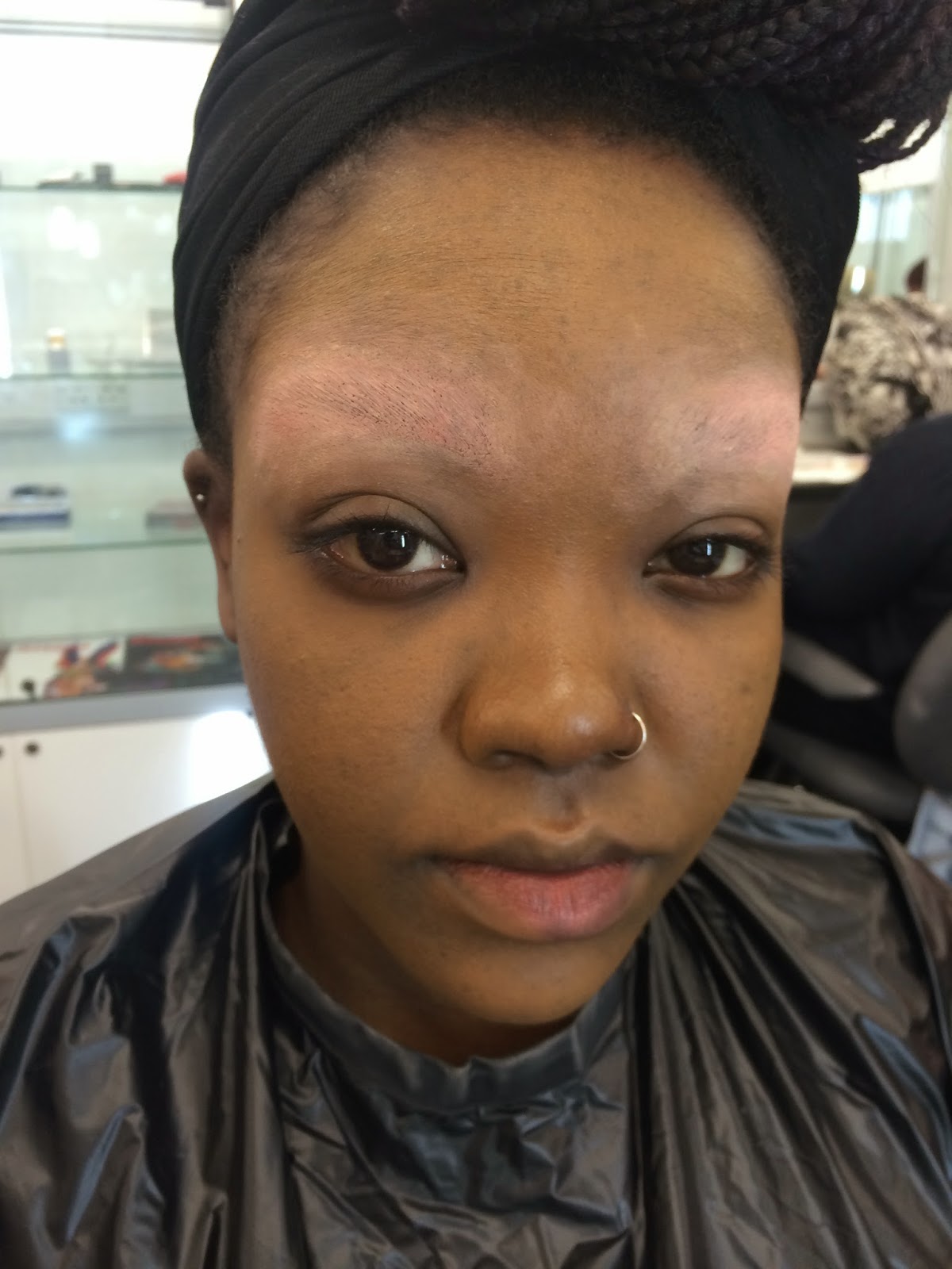
Firstly my partner, Beth started with creating a very pale base which was very popular in the 16th century especially the extremely powered look. We wanted to slightly warm the skin up so it was pale but had a glow to it, so we used a gold paint over the face to warm the complexion up. Then she set the make up with a white translusent powder to give that powdered Elizabethan look. 

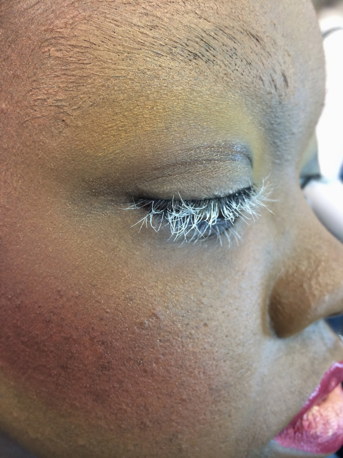
Next was the blush, we used the traditional red on the cheek however the application was modern, we contoured the cheeks under the apple and up the sides of the face to define the edge of the face. Next was the brows and lips, in the Elizabethan era is was known to either have very fair eyebrows and lashes or none at all, in this design we've painted the brows and lashes white to lighten them in a contemporary way. She used a disposable mascara wand and white paint to create the lashes and a small brush, white paint and a brow comb to create the brows. For the lip application we changed the design from the previous design I had a before it was very contemporary, shape line and in the centre however this time we wanted to go a little more traditional Elizabethan with the lips and dap a little red over the lips to warm the up a little bit. This application was light and no to heavy on the lips as we wanted to keep it simple.   


Here was the final look of my design
Make up designer- Me
Make up Artist- Beth

We then showed our lecturer our make up design and asked her if there was anything we could improve on or change. She wasn't pleased with the eyebrows as she said up close they looked a little messy, on the day we will be photography the make up from all angles and Beth forgot to go over the ears and further down the neck area so it all blends. She said we could buff the make up in more just to make sure every things blended and worked into the face instead of sat on top. We took all this advise on board and went back over to over make up stations to improve the look. 


This was the final look after we adjusted it. Beth worked the make up over my ears and all the way down my neck so it completely blended with the face. She neatened up the eyebrows by brushing through the brows more, neatening up the edges and powdering on top.
 She also used a blending brush and worked the make up into the face more. 

Once the adjustments were done I was very happy and pleased with the make up. Beth did a good job a creating my design as this is the first time she's fully created the make up without any adjustments. We have another session before the timed assessment for Beth to work on this design and get it completely right the first time. Overall I'm very happy and pleased with what Beth achieved today and its what I wanted my make up to look like, there is only minor things Beth can work on however we do have another session to practise this again before the real assessment in this time Beth could easy improve the minor things like the blending and the brows in this space of time. 


Wednesday 26 November 2014

My Final Practise at my partners Design


This was my final Practise of my partners make up design before the actual assessment. I started with setting up my work station with all the products I needed to complete the make up design. I started with applying the Illmasaqua primer to her face with a foundation brush and then placed a bar of natural soap in some warm water ready to block the eyebrows out. I used a spatula to scrap away some of the soap and placed it on the back of my hand. I then used my finger to wipe the soap across her brows and used a brow comb to brush her eyebrow hairs upwards. I then created another layer of soap to make sure the whole brow is flat and firm and then I allowed this to dry.

 I then started with the base of the make up which was applying Charles fox derma colour camouflage concealer colour D13 to the whole face to create a flawless under coat. When the eyebrows were dry I applied colour D1 and then D32, this was to block out the colour of the brows ready for the top coat of make up to make sure they look completely gone. D32 is like a dark red skin tone so over the top of this colour I reapplied D13 which is the correct concealer colour for my partners skin. 

Once the base was completed I then applied the foundation which was by Mary Kay and this was mixed with Charles fox supra colour gold. This was to skin a glowing gold tint to the foundation and give a flawless coverage. With my foundation brush I applied the gold tinted foundation over the whole face, ears and neck. This gave the final coat on the brows which made them completely disappear.

Next was the powdering and contouring of the face, I started with powdering the face with the Illamasqua white loose powder this was to set the makeup and give a matte look. I then started working on the eyes, I used a mix of yellow and orange from the Charles fox Viva Brilliant colour palette and applied this round the corners of the eyes and over the lids. For the cheek I used a red blush from the Charles Fox blusher palette and applied this under the cheeks, the sides of the temple and slightly up the side the forehead and blended at the top of the forehead. I used an angled bush brush to contour the face this was to give accurate precision. 

Next was the eyelashes, on the design the eye lashes were white, I didn't have a white mascara so I used a disposable wand and used the Charles fox supra colour in white for the lashes. I did this by placing some of the paint on the back of my hand and rubbing the wand in the paint. When applying the mascara I started at the roots and wiggled up through the lashes to give a full coverage. 

With the lips we slightly changed the lips during our last make up experiment as we went from a yellow/gold to a red in the middle and at the end we decided we preferred the red on the outer lip and gold in the middle. I used the mini lip rouge palette for the red this was colour LC008 and in the middle was gold supra paint by Charles Fox and used a small lip brush to apply the product.

This was the design complete, we then went to the studio next door where we took some photos and looked at the make up through the camera to see what it looked like and what could be improved or enhanced for the camera. 

Full Make up design
Close up to the eyes and brows
Close up to the lip application
photo of the make up taken in the studio for testing
Another shot
The feedback I received when looking at the make up through the lense was I needed to apply the colour a little harsher for the camera to pick it up. Another was that because the skin has a gold tint it reflects off the light and create a shine on the main points which was the top of the forehead and the nose. My lecturer told me either I could tone down on the gold in theses area or make sure its powdered more. The red and yellow contouring didn't show as much as what it looked like to the eye so again my lecturer, Lottie told me I need to apply more so the camera can pick the colour up. 


I went back to my station and tried to improve my look so it was camera ready. I applied more red blush on the cheeks and temples, I applied more yellow over the lids to create more definition for the camera. Another thing I needed to concentrate on was the shine on the nose and forehead, what I did to improve it was apply regular foundation on the forehead to cover the gold a little more so its not as glowing and then I powdered over the forehead and more on the nose.


This was the final outcome of my improved look


hand palette of colours used
Overall I'm very pleased with the outcome of this design, I think it went really well and didn't have any problems with the application. I was very happy with how the blocked eyebrows came out as on camera you couldnt see them at all which I was very pleased about. I think I completed the design to the standards my partner wanted and was very happy with the final look. On the day I just need to make sure I'm prepared and have all the products I need to complete the final look. I'm feeling confident in applying the make up for the assessment however just a little nervous for the day. 


Saturday 22 November 2014

My Assessment Partner experimenting with my Design and Creation of Final Design


 In my recent make up studio lecture I had to bring in either one or more of my make up design that I drew. This was for my partner to study my design and try out the make up design on me. This lecture was allocated to swap design with my partner, for my partner to attempt my design and experiment with the looks. We started off with looking at two of my face charts that I drew as these were my favourites, one was based around red and one around purple. 

My partner, Beth, started with applying the base of the make up which was very pale foundation. She used a mix of white base foundation and the lightest foundation from the Charles fox 8 foundation palette. Once the foundation was applying she set the make up with a white loose powder by Illamasqua, this just got away any shine or grease to the skin. Beth then contoured my cheeks with Charles fox, viva brilliant palette lavender colour. The contoured defined the cheeks and was brought slightly up the sides of the temples by the end of the brows. We then experimented with shading over the eyelid and down the nose, this wasn't in my design plan however we thought it looked nice as it added more colour to the face and definition. 


After looking in the mirror for a white me and Beth was studying the face and thought the purple on the pale skin made the face look very neutral so we asked for our lecturer, Sue, of her opinion. Sue came over and said the colour didn't look very Elizabethan and the purple made the face look very cool. We then suggested to Sue if we tried out the same design however used red, as red was definitely more Elizabethan on the face and I had already based a make up design around the colour red. We then wiped the contouring off and started again. As the skin was very pale we wanted to warm it up ever so slightly and Sue gave us the idea of applying the gold supra paint over the skin lightly so it gave a gold tint to the face and warmed the skin up. We tried out this idea and found the gold did the job and warmed the skin up and looked lovely on the face. 


We then carried on with the original plan of the make up design however just instead used red. We contoured the cheeks with red a built it up around the side of the face which looked lovely over the pale gold skin. We then filled in the eyebrows with a small make up brush using the red supra paint and just followed the natural line of the brows. We used the same red supra paint from the eyebrows to use on the lips as well which we painted just in the middle section just like my design. Finally was the eyelashes which were to be white, we didn't have a white mascara so we used a wand and spread the white supra paint over the wand and applied to the lashes just like mascara.


 Once we completed the design we gave a hard look at the make up and thought if it suited the category of contemporary Elizabethan make up. Me and Beth then discussed what we could do to improve the design to look a little more Elizabethan. We then realised that we think the eyebrows were a little to bright for the design and made it a bit too contemporary and we had to step back a little to become more Elizabethan. We asked for Sue opinion again and she said she liked the eyebrows and they did look really good however she understood what we meant when there were quite striking for the design. We then decided to try it with the eyebrow white like in the original red make up design I drew. Again we took of the brows and Beth used the White supra paint to paint over my eyebrows in white. Finally we felt much happier with the design and felt the contouring of the cheeks and the lips looked much better against the pale shimmery gold face complimented with white eyelashes and eyebrows. We didn't want to over power the look too much with colours and go to over the top with modern ideas. 

 Sue came back over the have a final look at our completed design and she questioned the lips if they were too bright for the design and if they would look better smudged. We then used a brush and smudged just the bottom lip across and left the top as it was and told us to have a think about that idea. We decided we really liked it when the lips were a little more subtle however we wasn't sure on just keeping the top lip the same. Me and Beth then decided to smudge the top lip as well so the lips were soft and just dabbed on, this was definitely more historical Elizabeth as there lips wouldn't be defined in the 16th century just smudged on. I was very happy with this final look after experimenting with the design and realising what look good and suited the project best. I'm much happier that I changed the colour and gave myself an option with my make up designs through the colours and technique. I think in my final assessment I will be using the final outcome of this lesson look as I think it fulfils the brief after development and experimentation on my design.


Friday 21 November 2014

Historical Make up Reference

Historical Make up Reference

http://madamenoire.com/329699
/women-shave-their-eyebrows-just-draw/
http://imgkid.com/queen-elizabeth-1-as-a-baby.shtml
http://makeupthroughtheages.blogspot.co.uk/2012/02/
as-aspiring-makeup-artist-one-thing-has.html


I have chosen three portraits of Queen Elizabeth 1 that reference my make up and show historical influences to my designs. In the first portrait of Elizabeth it's a close up to her face this shows her skin and make up very well. Each portrait of Queen Elizabeth 1 looks slightly different as not all of them are face to face paintings some were painters own personal image of what they thought Elizabeth looked like. As Elizabeth got older she became conscious of what she looked like and didn't want painting done of her. This lead to her controlling what portraits of her were seen and what ones weren't. In the close up one of her face you can see her face is very pale and defined slightly at the temples. Her eye sockets look slightly sunken and defined by the brow bone however there is no eyebrow there at all. The eyebrow is replaced with what looks like skin underneath or just her hair is very fair. In my recent make up design I drew I have either painted the eyebrows white so they look very fair so you cant see them or I've completely blocked them out. In the portrait Elizabeth seems to have no eye lashes either, as in the 16th century it was very popular to have no eyelashes either because they've fallen out because of the chemicals used, there very fair or you've just plucked them away. In my design I've completely painted the eye lashes white, against a white face there unnoticeable or very vague. Her lips and cheeks are slightly red, the cheeks are applied just on the apple of the cheeks, contouring the bone was not around or neither popular then. The lips are stained red and wouldn't of been done with a brush so the edges wouldn't be sharp or neat. In the middle portrait it looks more like an oil painting and in this picture Elizabeths face look extremely white as in the first portrait it looks more of a natural pale base. The second image almost looks as its bleached out white or its been enhanced to look that white. The same with the lips, it just looks dabbed on however this time the red looks slightly brighter. In the third image again her face is very white and the red blush goes along the cheek slightly wider than the first portrait.The definition of where her eyebrow would of been is there but there no actual eyebrow there again. Her lips are a rosy red and if vaguely put on, the lips haven't been defined or outlined so they look very thin small. White/cream and red is also a very popular colour to wear by the Queen, in most of her portraits she tend to always be wearing one of these colours. I think in design I definitely have the aspects and influences or Elizabethan era such as the base colour, eyebrows and lashes. I feel maybe in a further design I could incorporate red as it was a very popular colour in the era and could experiment with that colour. 


Elizabeth 1: Golden Age -Character Comparison to my Contemporary Elizabethan Designs

In our recent seminar we watched the film Elizabeth 1: Golden age, as a few weeks back we watched Elizabeth 1 1998 film as well. During watching the film we ere told to look as the characters in the film either Queen Elizabeth herself or any other character and compare there looks throughout the film to my design and reference there look/hair/make up. This is to see how there historical 16th century looks, look similar to mine or even a contemporary version of it.

Queen Elizabeth 1:
A mature Queen Elizabeth endures multiple crises late in her reign including court intrigues, an assassination plot, the Spanish Armada, and romantic disappointments. In this 2007 film, Queen Elizabeth 1 has a variety of looks for each occasion and day. She has quite similar make up throughout most of the film however her dresses, colour and style changes throughout. 

At the beginning of the film Queen Elizabeth wears a very bright and patterned long sleeved orange, red dress. This is completed with a simple pale face, fair eyebrows and slightly tinted red lips. She had a large cream ruff around her neck, her hair is in a curly up do with feathers attached to the top. I think the base of the make up and the fair eyebrows has similarities to my make up design. I still haven't got complete final design as I'm still in the development and experimental stage with the designs I like. When applying on a face chart and then applying on a person the design can look slightly different. Therefore me and my partner are still exploring ideas and experimenting with what looks good. I feel if I could incorporate something from this image from the film Elizabeth 1: Golden Age I could maybe use aspects of the colour of her dress into my design. As colour is an important factor in the design as it represents the theme, class and the era. 

One of the following dresses in the 2008 film was a long sleeve fitted, yellow/gold dress. In this movie Elizabeth seems to wear a variety of bright colours, I think this is because If you were wealthy (or the Queen) you could afford better materials that could of been imported and in a variety of rich colours. In my assessments partners design her colours are based around gold/yellow and red, which are colour used a lot for Elizabeth in the film. These colours are classed as rich colours. Again on her head is another accessory, accessories and jewels on the Queen was a very common use.

Later on in the film she wears a very covered up green dress, this dress is not as bright and over powering as the other colours its more of a subtle green. The green really neutralises her face in this dress and make it look very pale and bland. Her her is kept simple, short, curly and in an up do. Elizabeth throughout the film tends to wear quite a lot of wigs which were all different shapes and styles. Throughout the film Elizabeth wears her hair up however in one of the last scenes during the battle she has her hair down and very long.


Nearer to the end of the film Queen Elizabeth wears a very bright purple dress, the again is long sleeved and goes all the way up to the top of her neck. This colour has been used on one of my contemporary Elizabethan design. The base of the make up was very pale and the eyebrows white as Elizabeths were sometimes gone and if they were they were very pale they looked almost white. The contouring and lips were very contemporary and was a shape of this type of purple. I used purple as its classed a a royal colour and was used in the film. This colour scheme and make up have small influences and comparisons to my recent experimentation design which my partner created on me. I think watching this film has made me think of the colours that were used in the era on the Queen and also the natural pale base of the skin and looking at the simplicity of the make up, colours of the clothes and the curly, up dos.


https://cinemattire.wordpress.com/2014/01/16/rainbow-week-green/
http://www.imdb.com/title/tt0414055/
http://www.popmatters.com/article/cate-blanchett-returns-as-queen-elizabeth-i-in-the-golden-age/
http://www.chud.com/12071/interview-cate-blanchett-elizabeth-the-golden-age/
http://lifeissweet16.wordpress.com/2010/06/02/robin-hood-and-alison-weir-the-odd-couple/


Thursday 20 November 2014

Further Make up Ideas for My New Elizabethan- Assessment Partner creates on me

I have started looking into a variety of make up designs that I could possibly use for my contemporary new Elizabethan make up. Iv'e draw up 3 new make up designs that are based around the Elizabethan theme however have contemporary techniques and ideas to them. I started looking into different colours that I could use for my make up design and what look represent the Elizabethan era. On the day of our assessment we will bring in our final design, notes of how to create the look and pictures, this will help my partner create the look I designed for them on me. Below I have draw up 3 new Ideas that could possibly lead towards my final design.

CONTEMPORARY TO HISTORICAL ELIZABETHAN DESIGNS

This first design I have created is very contemporary however has Elizabethan influences to it. I've made the skin very pale which is a natural and sometimes forced colour in the Elizabethan era as it was popular too have pale white skin. I've based this design round the colour of deep purple, this is because I feel the colour purple represents royalty . For the cheeks I've contoured them with purple and slightly going up the sides of the face, this technique is very contemporary and is used in modern day. The eye lashes I've put them completely white and blocked out the eyebrows with soap and applied white over the top. It was very traditional in the Elizabethan era to have very fair eyebrows or either none at all. The lips I kept them really small in the middle with a harsh line to define the lips, this was done with purple supra paint. 

As you can see in the design I've kept the base of the make up traditionally very pale again. I used a red powder to contour the cheeks and up the side of the face and down onto the forehead. This creates a heart shape on the face with the contrast of white to red. For the eyelashes they are painted white again to keep them very light and fair, the eyebrows this time is just combed through with the white paint to make the eyebrows look like there completely gone. The lips again are the same style and shape however is painted with a deep red.

This design is very similar to the first design I've just changed it ever so slightly. The base is the same, very pale and flawless, the contours the same, just highlighting the bone structure and giving definition and the lips are painted in the middle with the purple supra paint. The slight difference I've done in this design is that I've applied purple eye liner to the water line to highlight the eyes and instead of the eyebrows being traditionally white I've gone very contemporary with this design  and painted the eyebrows purple with the supra paint, this would be applied with a small brush and just colour in the eyebrows were the original brow is. In each design I want the skin flawless and powdered so its not greasy at all. This is very traditional Elizabethan as in the 16th century they would tend to powder there face alot so it was very powdery, so much that you could see it. 

Assessment Practise from my Partners Designed Face Chart


In our recent make up lesson it was my turn to study the design that my assessment partner has created for me on the day of the assessment. We can both create our designs and we were aloud to swap over beforehand so we could practise on each other. In today's seminar Beth brought along her design that she drew with make up of what she wanted me to create on her for the final assessment. She had a full chart and a little bit of information at the side highlighting the use of colours and where abouts.

As Beths design had blocked out eyebrows in this design I started with trying to make them disappear. I placed a scent free, sensitive bar of soap in a bowl full of warm water. I then used a spatula to scrap off some of the soap and then I placed it onto the eyebrow, I then used my finger to flatten the eyebrow hairs down and blend it away to the skin. As Beth has a dark complexion and dark eye brows I needed to use a colour that would get rid of the colour of her eyebrows and then place her natural colour on top. I used the derma colour camouflage palette colour D1 which is a pale yellow and D32 which is like a reddish skin tone. I applied this onto the soap once it was dry and blended the concealer in. I then needed to apply concealer to the rest of her face so I applied colour D13 to the rest of the face and then used my brush to dab her real colour on top. I didnt blend it in as then it would just start mixing all the colours round and I wanted it to sit on top to block the natural colour. I then slightly powdered the brows to let them set just before I applied the foundation.


For the foundation we kept the same idea from the experimental design which was mix her foundation with gold. I used Beth's own Mary Kay foundation with a mix of Charles Fox Supra colour on the back of the hand and applied to the whole of the face. I then used a dab of white powder over the foundation just to get away the greasy look to the skin. I then started with the contouring of the face with red from the Charles Fox blusher palette and Yellow from the Viva brilliant colour Medley palette. I the applied the red to under the cheek bone and up the sides of the temples to highlight the cheek bones and the yellow from the corner of the eye to the centre of the eye lid and up to the eyebrow. The eyelashes again were white like the previous design we created, this was done by the white supra paint and a mascara wand. I started from the roots of the lashes and worked my way up to get thickness and length. For the lips the design showed a yellow/gold colour blended into red in the middle. I started with a mix of the yellow supra colour and the gold and applied it to the whole of the lips, I then applied the red supra colour to the middle of the lips.


We studied the design slightly and asked our lecturer ,Kat, if we could get feedback on the design for Beths design behalf and also on the application for mine. Kat asked us how we felt about the lips and we thought it was a little to bright for the design. Kat agreed and told us she thought they were a little to contemporary and modern for the make up we were creating and told us to experiment with the colours on the lips as she thought we could create something better. When she gave us the feedback she said how she loved the yellow and red contouring against the gold skin tone and how I could probably apply the colour a little heavier as It works really well with the skin tone. I then applied more red Blush around the cheek bones and a little more yellow over the eyelids. I decided to take of the lip stick and try out a different colour like Kat suggested to see if it worked better with the make up design. I then started applying a red lipstick to the lips this was the colour LC008 from the Charles Fox Rouge mini palette, I think this colour looked nice and I really like it and it suited the theme of Elizabethans better however I thought it looked a little plain for the make up. We then thought about doing the reverse of the previous colour and applying gold to the middle of the lips instead, this came out really good and I was very pleased with the outcome after we played around with the colour. I think the colours are very complimenting to each other and look beautiful against the golden skin tone. I'm really happy with this make up and feel confident to re create it. Beth was very happy with the outcome of her design and thought her design changed for the better.


Another piece of feedback I was given was when blocking out the eyebrows to make sure I comb all the eyebrows hairs upwards this will make them thinner and easier the block out as they will be scraped up and flat the the surface of the face. Kat said this would improve my eyebrows and make them blend in with the skin more and not stand out on the face. 

Overall I'm very happy with this design and I think after the experimentation the design finally pulled together and looks very contemporary Elizabethan.